
Your bed looks flat or chaotic because you are guessing at colors instead of following a design structure. Learning how to match bed sheets effectively requires more than just picking a favorite hue. It demands a strategic approach to layering textures and balancing tones to create a cohesive bedroom sanctuary.
This guide reveals the professional 60-30-10 formula used by interior stylists to achieve perfect visual harmony. You will discover proven color combinations, learn to mix materials like linen and satin, and avoid common mistakes that ruin bedroom aesthetics.
Apply the 60-30-10 Formula for Perfect Balance
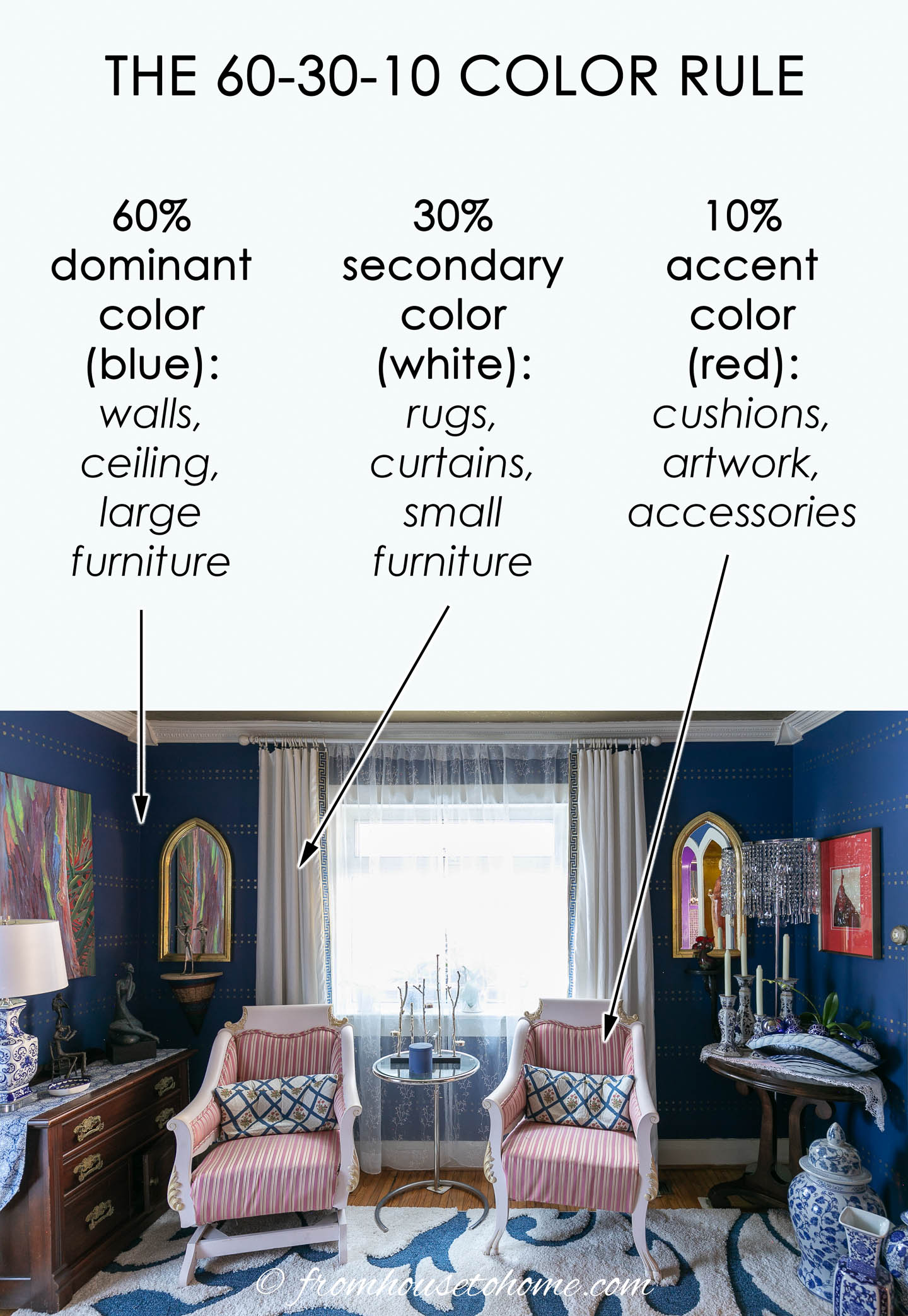
The secret to a professionally styled bed lies in the 60-30-10 rule. This design principle divides your bedding into three distinct layers to ensure visual balance without overwhelming the space. By allocating percentages to specific items, you create a look that feels intentional rather than haphazard.
Establish the 60% Base Layer
The largest visual element on your bed must occupy 60% of the total look. This is typically your duvet cover or main quilt, and it sets the entire tone for the room.
- Choose a terracotta linen duvet for warmth and earthy energy.
- Select a white satin cover to maximize brightness and airiness.
- Opt for a charcoal cashmere duvet to add luxury and depth.
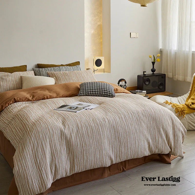
This base does not need to be a solid color. A subtle weave or natural texture like linen slub adds necessary interest without creating visual noise.
Define the 30% Secondary Layer
Your sheets and standard pillowcases make up the supporting 30% of the design. These pieces should contrast or complement the base layer without competing for attention.
Think of this layer as the bridge between your dominant duvet and your accent pieces. Crisp white sheets under a toffee satin duvet create a clean break. Khaki linen sheets paired with a white duvet offer an elevated neutral aesthetic.
Avoid matching your sheets exactly to your duvet unless you desire a minimalist monochrome effect. A slight shift in tone or texture prevents the bed from looking flat and one-dimensional.
Add the 10% Accent Layer
The final 10% is where your personality shines through specific details. Use throws, decorative quilts, or Euro shams in a contrasting color or pattern to finish the look.
- Drape a Pendleton check throw at the foot of an indigo duvet bed.
- Stack fog Euro shams behind pillows on a charcoal bed setup.
- Layer a linen diamond quilt over a satin cover for textural contrast.
This layer should draw the eye immediately but never dominate the composition. One or two well-chosen pieces are sufficient to complete the ensemble.
Select Proven Color Combinations for Your Space

Color sets the emotional mood of your bedroom. The right palette can make a space feel cozy, calm, or energized depending on your needs. These curated combinations are tested to work in real homes across various styles.
Warm and Earthy Tones
Earth tones create a grounded and inviting atmosphere perfect for sanctuaries. Rust and terracotta form a dynamic duo that brings warmth and energy to dark rooms. Pink clay paired with terracotta feels nurturing and modern for boho interiors.
Hazelnut and terracotta offer a tonal match ideal for farmhouse or cottagecore styles. For a dessert-like indulgence, combine cacao with crème to ground the look with deep brown while keeping it light. Charcoal and oatmeal provide a chic contrast that suits timber furniture beautifully.
Cool and Calming Hues
Cool tones promote relaxation and are ideal for sleep-focused environments. Sage and white create a fresh, airy vibe that suits minimalist or Scandinavian rooms. Lagoon and crème evoke a spa-like retreat with marine-inspired tranquility.
Cacao and lagoon present an unexpected yet balanced contrast between earthy brown and cool blue. This pairing adds intrigue without creating chaos. These combinations help transform your bedroom into a restorative oasis.
Minimalist and Neutral Palettes
Neutral combinations are versatile and never go out of style. Oatmeal serves as a warm beige that feels fresh year-round when used in linen. White remains the ultimate classic for maximizing brightness in small spaces.
Portobello acts as a muted green-gray that enhances organic cabin warmth. These palettes age gracefully and work with future décor changes. They are a smarter investment than bold, short-lived hues.
Mix Textures to Create Visual Depth

When color contrast is minimal, texture becomes the hero of your design. Combining different materials adds richness and prevents a flat appearance. This strategy is essential for achieving a high-end look with neutral colors.
Pair Linen with Satin
Linen offers a matte and slightly rumpled texture that contrasts beautifully with smooth satin. A linen duvet cover paired with satin sheets creates tactile luxury. Conversely, a satin duvet with a linen throw provides elegant contrast.
This combination works exceptionally well in neutral schemes where color variety is limited. The interplay between the glossy and matte finishes adds sophistication. It ensures the bed feels as good as it looks.
Layer with Chambray and Stripes
Chambray and window-pane sheets add subtle pattern without overwhelming the eye. These are perfect for family homes because they hide wrinkles and minor stains effectively.
A linen chambray sheet set under a white duvet looks styled with zero effort. This approach creates a casual and lived-in aesthetic. It pairs well with solid duvets in white, charcoal, or terracotta.
Use Quilts and Throws Strategically
Textured accents like diamond quilts or waffle weaves add necessary dimension. Drape a linen quilt at the foot of the bed for instant style. Fold a cashmere throw over one corner to elevate the entire look.
These small gestures signal that it is a curated space. They provide an opportunity to introduce a new material. This layering technique mimics the plush feel of a five-star hotel.
Tailor Bedding Choices to Your Lifestyle

Your daily routine should heavily influence your bedding decisions. The best match is not just pretty but also practical for your specific household needs. Consider your cleaning habits and how much time you spend in bed.
Solutions for Low-Maintenance Homes
Families and pet owners benefit from effortless elegance that forgives imperfections. A white duvet paired with chambray sheets hides wrinkles and stains effectively.
The stripe pattern ensures the bed looks styled even when unmade. This combo creates the ultimate “woke up like this” aesthetic. Regular washing maintains the brightness and clean appearance.
Creating Luxury and Hotel Vibes
Want a five-star feel in your own home? Layer deep and rich textures for maximum indulgence. Use a charcoal cashmere duvet with satin sheets for a plush foundation.
Add Euro shams and a double stack of pillows at the headboard. Use fog or oatmeal accents to provide soft contrast. This setup is perfect for master bedrooms where comfort is paramount.
Styling for Minimalists
Less is more for those who prefer clean lines and uncluttered spaces. Focus on tonal variation and high fabric quality. A toffee satin duvet with white sheets keeps the look crisp.
Keep accents minimal with just one linen diamond quilt. Use matching terracotta layers for monochrome depth. The elegance comes from precision and aligned seams.
Avoid Common Bed Sheet Matching Mistakes
Even with the right formula, small errors can ruin the overall aesthetic. Steer clear of these common pitfalls to ensure your bed looks polished. Awareness of these issues saves time and money.
Overloading on Patterns
One pattern is usually enough for the entire bed setup. Avoid combining a patterned duvet with striped sheets and a floral throw. Too many competing colors create visual chaos.
Stick to one busy piece like a checkered throw. Keep the rest of the layers solid to maintain balance. This ensures the eye has a place to rest.
Ignoring Room Lighting Conditions
Dark rooms need light-reflecting linens to feel inviting. Bright rooms can handle deeper tones like charcoal or cacao. Match your colors to the available light in your space.
Use white or rust to brighten low-light environments. Try terracotta for warmth in sun-drenched rooms. Pair wood tones with portobello to enhance natural warmth.
Skipping Fabric Care Requirements
Some colors and materials require more upkeep than others. White and crème are timeless but may need frequent washing. Linen is durable but wrinkles easily, so embrace the look.
Satin is smooth but can snag if not washed gently. Choose fabrics that fit your cleaning habits and lifestyle. Proper care ensures longevity and maintained appearance.
Maintain a Cohesive Look Year-Round
Great bedding evolves with the seasons without requiring a full overhaul. Rotating layers allows you to adapt to temperature changes and shifting moods. This approach keeps your bedroom feeling fresh and relevant.
Rotate Layers for Seasons
Switch your materials and colors to match the time of year. Use cacao and crème with heavy cashmere for cocooning warmth in cooler months. Switch to sage and white with lightweight linen for an airy feel in summer.
Keep your main duvet the same and swap sheets and throws. This simple change refreshes the room instantly. It is an easy and cost-effective update.
Invest in Timeless Palettes
Trendy colors fade quickly while earth tones last forever. Oatmeal, portobello, sage, and charcoal age gracefully. These neutrals work with future décor changes.
They are a smarter investment than bold and short-lived hues. Sticking to these ensures your bed always looks stylish. Your bedroom remains a sanctuary regardless of trends.
Frequently Asked Questions About Matching Bed Sheets
How do I start matching bed sheets if I have no experience?
Start with the 60-30-10 rule by choosing a dominant duvet color first. Select sheets that contrast slightly in tone or texture for the middle layer. Finish with one or two accent pillows or a throw to complete the look.
Can I mix different patterns on my bed safely?
Yes, but limit it to one patterned piece to avoid visual chaos. Use a checkered throw or striped sheets as the single busy element. Keep all other layers solid to maintain balance and harmony.
Which color combinations work best for small bedrooms?
Light and neutral palettes like sage and white or oatmeal tones maximize brightness. These colors make the space feel larger and more airy. Avoid dark, heavy colors that can make the room feel cramped.
How often should I change my bedding style?
You can refresh your look seasonally by swapping sheets and throws. Changing textures from heavy cashmere to light linen keeps the room feeling current. Major color changes are only needed if you update your room décor.
What is the easiest way to make my bed look expensive?
Layer different textures like linen and satin to add depth and luxury. Add a double stack of pillows and a folded throw at the foot. Ensure all layers follow the 60-30-10 balance rule for a polished finish.
Key Takeaways for Matching Bed Sheets Successfully
Mastering how to match bed sheets transforms your bedroom into a stylish retreat. Remember to apply the 60-30-10 rule for structural balance in every layer. Choose proven color palettes like earth tones or cool neutrals to set the right mood.
Mix textures such as linen and satin to add depth without relying on bold colors. Avoid common mistakes like overusing patterns or ignoring your room’s lighting conditions. Your bed should reflect both your personal style and your practical needs.
Start today by evaluating your current bedding against these professional standards. Identify your base layer and see if your accents follow the golden ratio. A few strategic swaps can create a hotel-quality aesthetic in your own home.